設計一個不算差的UI介面
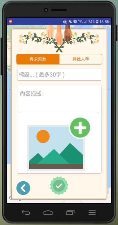
介面規劃
設計一個APP介面,如同一部電影,一樣的劇本(功能),可以有許多不同的呈現方式(介面),如果演員、導演、動畫呈現失敗,那劇情再好,也只是枉然
不過做APP不用這麼嚴肅,我們先練練手,讓自己做出來不要再吃手手~
新手可以先以下面五點為參考來設計介面:
- 設計界面盡量以簡潔為主
- 按鈕若以圖示代替文字,則圖示要易懂
- 操作方式以直覺為主
- 顏色、圖片風格一致
- 減少使用者多於操作的次數
補間動畫
如果只是放個按鈕,那真的是簡單多了…
現實中,你的介面如果有補間動畫,以及觸控反饋,不僅可以減少使用者疲勞度還能增加介面的友善度
觸控反饋
為什麼要有觸控反饋?
其實就像實體按鈕,你壓下去會回彈,這就是反饋,藉由反饋讓大腦得知"確實有按下這個按鈕"。
實作一個使用者介面
於Android Studio創建一個新專案這邊就不贅述了
直接跳到程式碼的部分
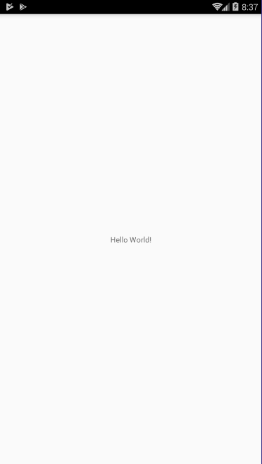
隱藏TitleBar
ActionBar在這個APP中沒有作用,所以我選擇將他隱藏
加入getSupportActionBar().hide();
所以目前程式碼會長這樣:
@Override
    protected void onCreate(Bundle savedInstanceState) {
        super.onCreate(savedInstanceState);
        setContentView(R.layout.activity_main);

        getSupportActionBar().hide();
    }
實際上看到的畫面就是
實現畫面移動效果
我們打開activity_main.xml後,先把Hello World!物件刪除掉
然後把主Layout當作背景圖層,並修改背景色
可以看到目前activity_main.xml的內容如下:
<?xml version="1.0" encoding="utf-8"?>
<RelativeLayout xmlns:android="http://schemas.android.com/apk/res/android"
    xmlns:app="http://schemas.android.com/apk/res-auto"
    xmlns:tools="http://schemas.android.com/tools"
    android:layout_width="match_parent"
    android:layout_height="match_parent"
    android:background="#ffb937">

</RelativeLayout>
加入一個子layout
加入的layout2當作主畫面,並設定另一個背景色給他 以及幾個常用的元件
<?xml version="1.0" encoding="utf-8"?>
<RelativeLayout xmlns:android="http://schemas.android.com/apk/res/android"
    xmlns:app="http://schemas.android.com/apk/res-auto"
    xmlns:tools="http://schemas.android.com/tools"
    android:layout_width="match_parent"
    android:layout_height="match_parent"
    android:background="#ffb937"
    tools:context="com.klapper.sampleapp.MainActivity">

    <RelativeLayout
        android:id="@+id/layout2"
        android:layout_width="match_parent"
        android:layout_height="match_parent"
        android:background="#b9dfb499"
        android:padding="15dp"
        tools:visibility="visible">

        <TextView
            android:id="@+id/textView"
            android:layout_width="wrap_content"
            android:layout_height="wrap_content"
            android:layout_centerHorizontal="true"
            android:text="這是一個測試APP"
            android:textSize="24sp"
            android:textStyle="bold" />

        <EditText
            android:id="@+id/editText"
            android:layout_width="wrap_content"
            android:layout_height="wrap_content"
            android:layout_below="@+id/textView"
            android:layout_centerInParent="true"
            android:ems="10"
            android:hint="帳號"
            android:inputType="textPersonName" />

        <EditText
            android:id="@+id/editText2"
            android:layout_width="wrap_content"
            android:layout_height="wrap_content"
            android:layout_below="@+id/editText"
            android:layout_centerHorizontal="true"
            android:ems="10"
            android:hint="密碼"
            android:inputType="textPersonName" />

        <Button
            android:id="@+id/button"
            android:layout_width="wrap_content"
            android:layout_height="wrap_content"
            android:layout_below="@+id/editText2"
            android:layout_centerHorizontal="true"
            android:onClick="enter"
            android:text="進入" />
    </RelativeLayout>
</RelativeLayout>
畫面如下
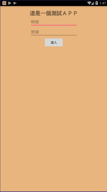
可以很明顯的感覺出來,介面很醜。
這樣看起來,顯然是元件之間太壅擠了,所以你可以嘗試增加元件之間的間隔,以及加入一些圖示讓畫面更活潑一點
實作控建移動效果
當按下"警告按鈕"時,登入畫面縮為0.87倍並往左抽去
縮放畫面加上移動可以產生一個立體的視覺效果
效果如下:

程式碼如下
public class MainActivity extends AppCompatActivity {
    View layout2;
    private float screenWidth,screenHeight;
    @Override
    protected void onCreate(Bundle savedInstanceState) {
        super.onCreate(savedInstanceState);
        setContentView(R.layout.activity_main);

        // 隱藏ActionBar
        getSupportActionBar().hide();

        // 取得手機螢幕尺寸
        DisplayMetrics metrics = new DisplayMetrics();
        getWindowManager().getDefaultDisplay().getMetrics(metrics);

        screenWidth = metrics.heightPixels;
        screenHeight = metrics.widthPixels;

        layout2 = findViewById(R.id.layout2);
    }


    //enter是設定在activity_layout.xml內Button的onClick欄位填入的名稱
    public void leftbutton(View v){
        AnimatorSet ans = new AnimatorSet();
        ObjectAnimator[] oan = new ObjectAnimator[3];
        // 移動Y軸,由原始位置移動screenWidth*0.45個位置
        oan[0] = ObjectAnimator.ofFloat(layout2, "translationX", 0,-(screenWidth*0.45f));
        // 縮放0.87倍
        oan[1] = ObjectAnimator.ofFloat(layout2, "scaleX", 1f,0.87f);
        oan[2] = ObjectAnimator.ofFloat(layout2, "scaleY", 1f,0.87f);

        // 動畫波形
        ans.setInterpolator(new AnticipateOvershootInterpolator());
        ans.playTogether(oan);
        ans.setDuration(450);
        ans.start();
    }

    public void rightbutton(View v){
        AnimatorSet ans = new AnimatorSet();
        ObjectAnimator[] oan = new ObjectAnimator[3];
        oan[0] = ObjectAnimator.ofFloat(layout2, "translationX", -(screenWidth*0.45f),0);
        oan[1] = ObjectAnimator.ofFloat(layout2, "scaleX", 0.87f,1f);
        oan[2] = ObjectAnimator.ofFloat(layout2, "scaleY", 0.87f,1f);
        ans.setInterpolator(new AnticipateOvershootInterpolator());
        ans.playTogether(oan);
        ans.setDuration(450);
        ans.start();
    }
}